Logo design is an important aspect in making branding or rebranding that can either make or break a company’s image. A well-crafted logo has the power to capture the essence of the brand instantly. On the other hand, bad logo design can lead to confusion and misinterpretation. In this blog, we want to give you some examples of famous brands whose bad logo design has resulted in public backlash.
1. London 2012 Olympic Games
The logo for the 2012 Olympics in London caused quite a stir when it was unveiled. The abstract and enigmatic design, featuring irregular shapes and bright colours, left many spectators scratching their heads. While the intention was to capture the spirit of the games and the diversity of the host city, critics argued that the design lacked clarity and failed to resonate with the public.
2. Pepsi
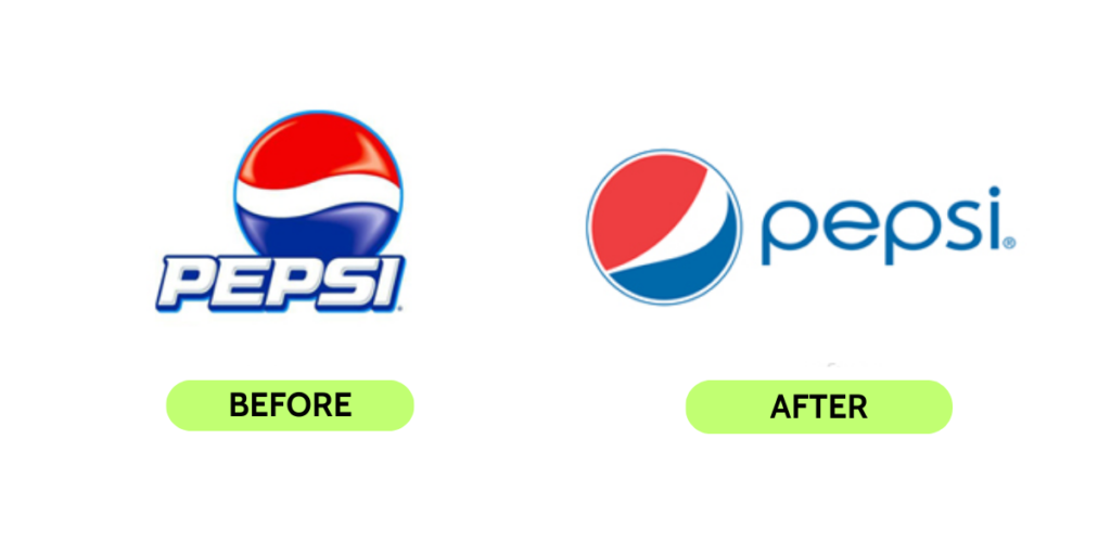
In 2008, Pepsi decided to undergo a logo redesign to give its brand a fresher look. However, the changes were met with mixed reviews. The new design featured a simplistic and generic appearance, ditching the familiar red, white, and blue globe for a minimalist approach. Many consumers felt that the redesign lacked the charisma and uniqueness of its iconic predecessors, leading to a nostalgic longing for the classic Pepsi logo.
3. Tropicana
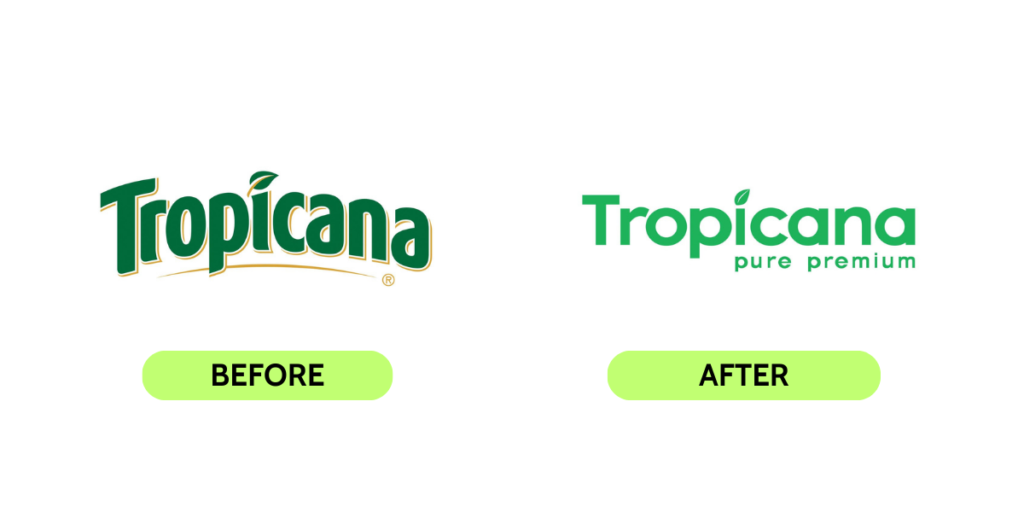
In 2009, Tropicana, the popular orange juice brand, attempted a logo redesign to revitalize its image. The new design, however, received a wave of backlash. The vibrant and recognizable image of an orange with a straw was replaced with a plain and generic design that failed to capture the essence of the brand. Customers were disheartened, missing the inviting and refreshing appeal of the old logo.
4. Gap
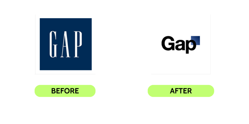
In an attempt to modernize the brand, Gap introduced a new logo in 2010. The change, however, backfired spectacularly. The new design featured a simple Helvetica font and a small blue square, which many found uninteresting and lacking in creativity. The public outcry was so intense that Gap had to revert to its classic logo within a week.
5. Hilton Worldwide

Hilton Worldwide’s logo redesign from 2009 to 2016 was criticized for alignment issues and excessive level resulting in an unprofessional and outdated appearance. The lack of visual harmony raised eyebrows among designers and critics. This serves as a valuable lesson on the importance of simplicity and balance in logo design for a timeless and appealing visual identity.
6. Microsoft

Microsoft logo has a new look signifies a new era for the tech giant. The new design shows innovation and adaptability in the industry. While some liked the classic emblem, most have accepted the change. The new logo resonates with a younger audience solidifying Microsoft’s position as a cutting-edge tech company. Microsoft’s redesign represented a commitment to positive change and ethical practices. Overall, it became a compelling and admirable logo transformation in corporate history
7. RadioShack

RadioShack attempted to rebrand with a new logo in 2013 when they were struggling to survive the competition. The design was supposed to resonate with modern and young customers, but it missed the mark. The new logo with bold letters and outdated design elements failed to serve its purpose of resonating its new logo with young customers.
8. Verizon
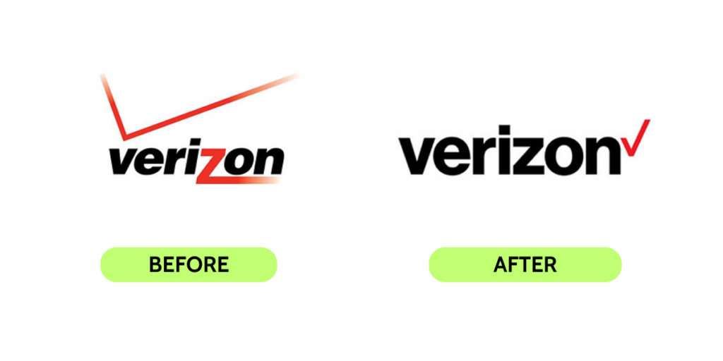
In a bold move, Verizon unveiled its new logo design in September 2015, which underwent a dramatic transformation. The iconic red checkmark, synonymous with Verizon, took a backseat, gracefully shifting to the right alongside the letter “n.”. The essence of the original logo remained intact, reinforcing Verizon’s commitment to simplicity, reliability, and unwavering dedication to its valued customers. The familiar red “z” in the company’s name gracefully vanished, making way for a fresh and contemporary identity that reflects Verizon’s evolution and future-focused approach.
9. Myspace

When the new social platform Facebook started gaining popularity Myspace attempted to regain users in 2009, MySpace introduced site redesigns, but this strategy seemed to backfire as most users expressed their dissatisfaction with the alterations. Moreover, their endeavour to change the logo at the same time received a similar response, with users disliking the new logo being a very simple and chaotic appearance.
10. Aol
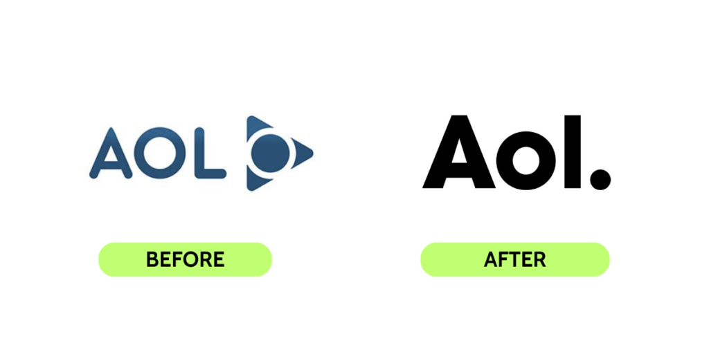
In 2009, Aol decided to rebrand with a new logo design. The lowercase, period-centric logo was meant to symbolize a more modern and user-friendly approach. However, the design faced backlash from both designers and the general public. Many perceived the logo as unattractive and unremarkable, lacking the distinctiveness that a major brand like Aol deserved.
These logo design missteps serve as valuable lessons for businesses and organizations about the importance of careful and thoughtful branding. A successful logo should not only be visually appealing but also reflect the essence and values of the brand, creating a lasting and positive impression on its audience.
Leave a Reply